How To Make Your Home Look More Expensive
How can you make your home look more expensive without breaking the budget? Is it possible to get a high end look and still have a comfortable, family-friendly home? Our homes have a direct link to how we feel and we’re more energetically happier, aligned, and energised when our homes are put together and look good. So keep reading to discover how you can make your home feel a little "extra" without spending a lot of extra!
Some smart design choices can significantly elevate the look of your home. You may not realise this but it is so important to live in a space that is beautiful and makes us feel good. When we live in a cohesive, functional and visually appealing environment, we show up differently; we feel energetically charged and higher. (The same applies to your working environment too, whether that's in your home or in an office).
When you are dressed up for an event with a fabulous outfit, maybe you've your hair blowdried and a gotten a manicure - how do you feel? You'll certainly show up differently compared to if you made zero to little effort! Most likely, you'll hold your head higher, feel happier and exude much more confidence. Now, compare that with how you feel when you’re in your old sweats with your hair up in a bun and haven’t showered for days. Or think about how you feel when you walk into Harrods, Selfridges, or Havey Nichols compared to how you feel when you walk into Primark. It’s a different vibe, right? All stores are good and certainly have their place, but you cannot deny that one type makes us feel different than the other.
How does this apply to your home? Well, we want our homes to feel a little dressed up, you know… a little extra (while still being comfortable and liveable) because you should feel good in your home. So, here are some strategies and suggestions to give your home that expensive look. You can do this on any budget and pick and choose which ideas you connect with and that would work in your home.
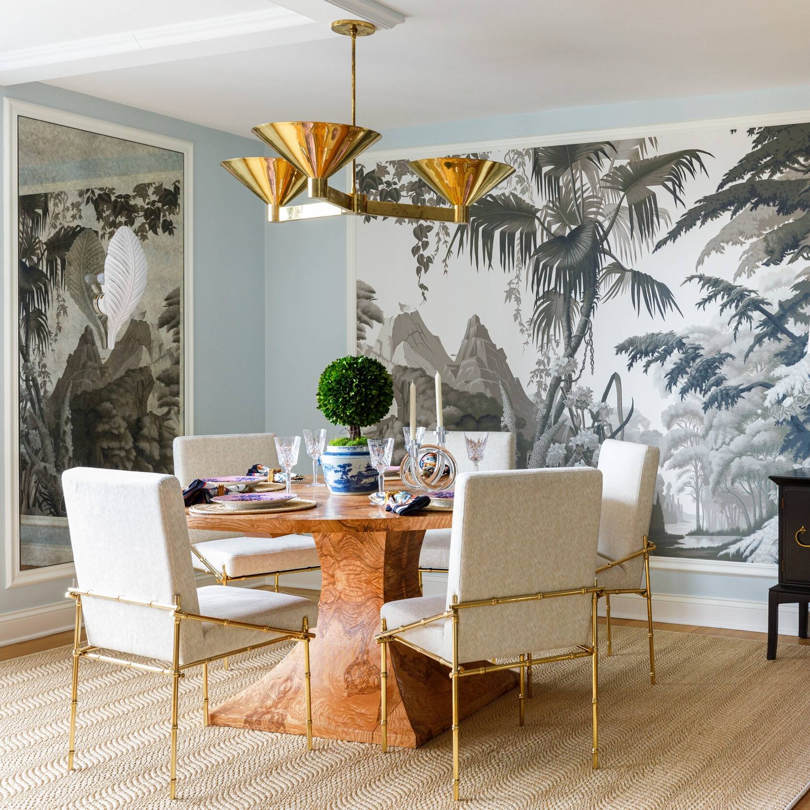
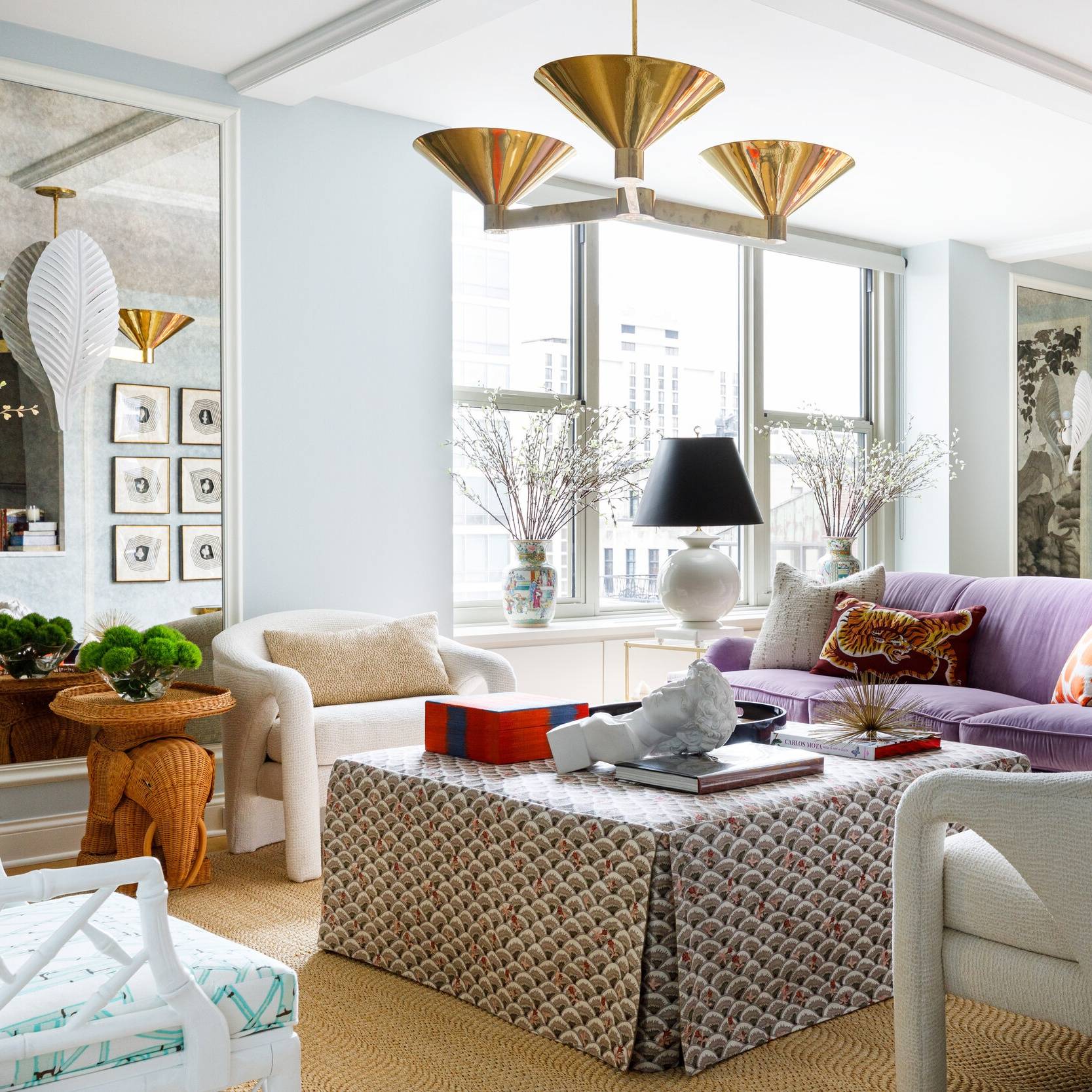
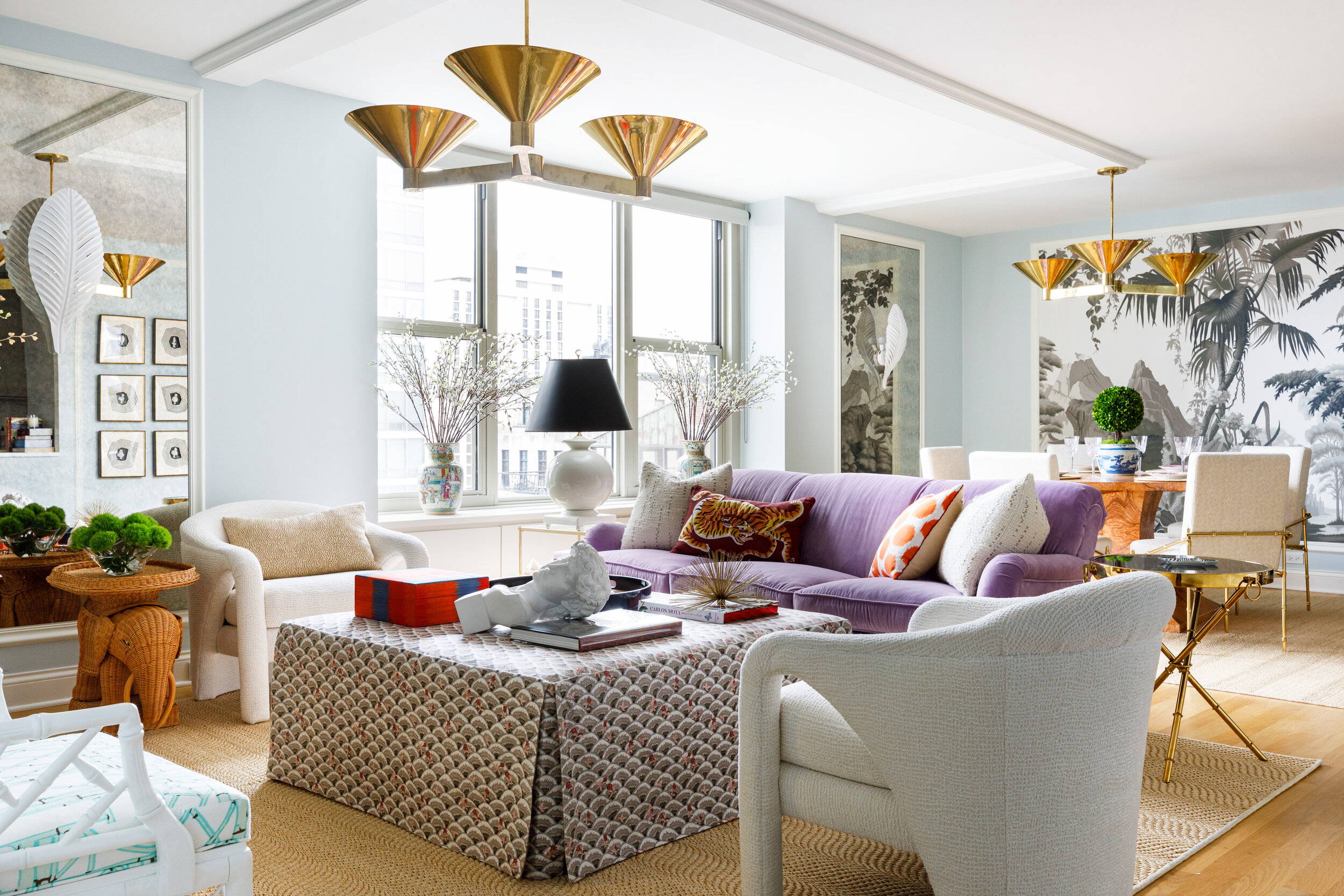
Sarah Vaile Design | Gold Coast Apartment
Choose & Use a Colour Palette
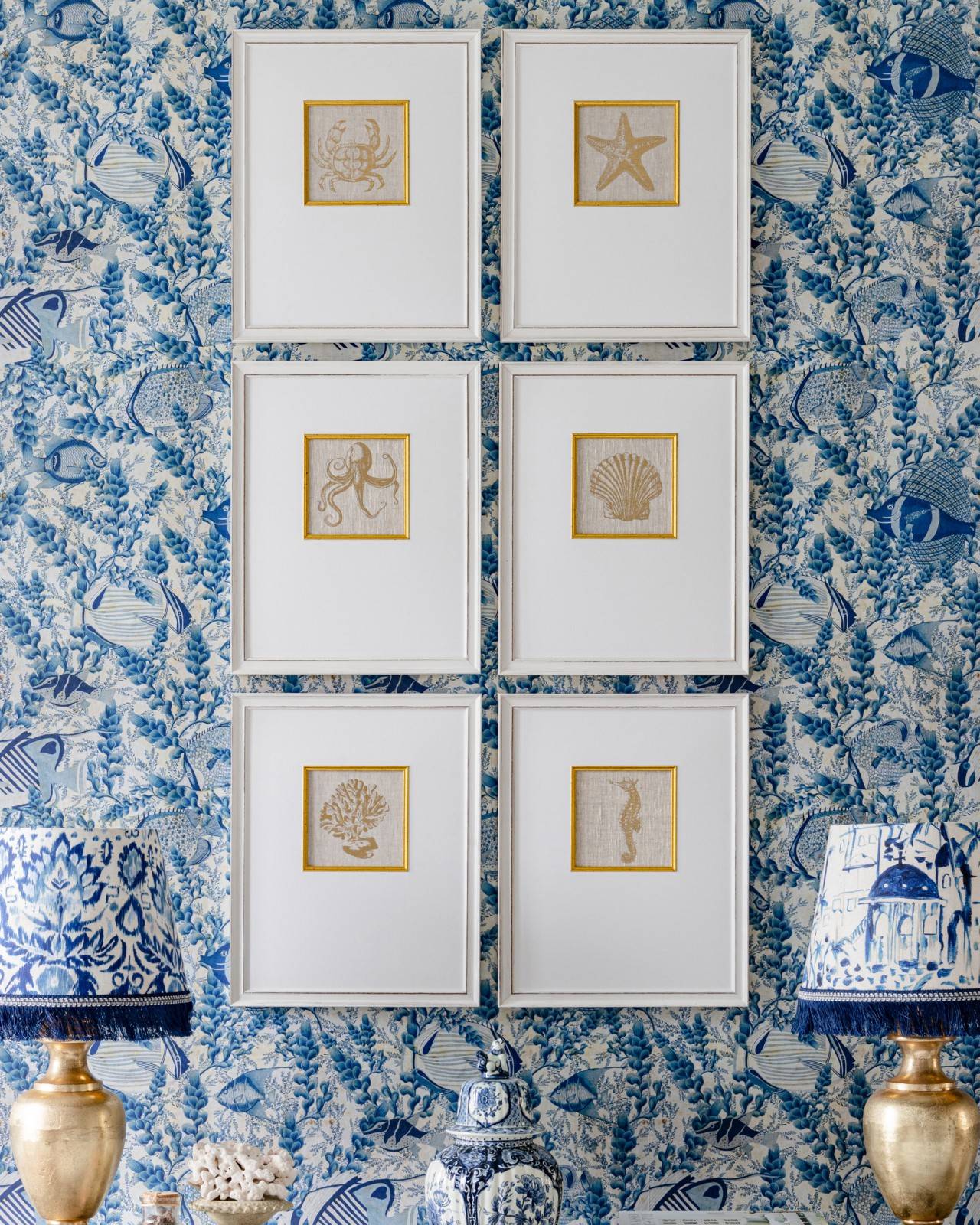
High end homes and model homes, which both do an amazing job at making you want to buy a home, often have one thing in common. They have a cohesive colour palette. In other words, all the rooms flow together and feel connected from the front hallway right up to the master bedroom. You'll see similar colours repeated throughout the home which is luckily something you can easily do in your own home!
When selecting a colour palette, we suggest sticking with 3 colours and those are the 3 colours you'll see throughout your home. An important tip when working with a colour palette is to use varying shades of the 3 colours. It keeps your home from feeling flat which can give off a tired, dated feeling.
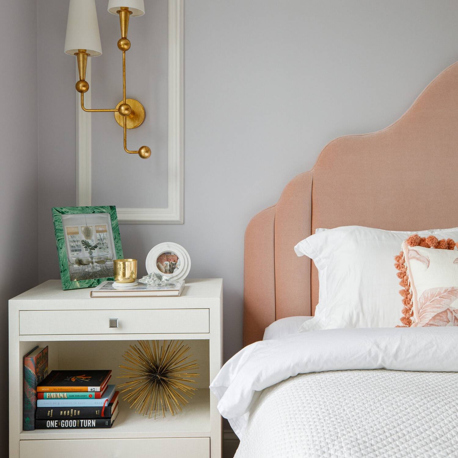
For example, if your 3 colours consists of white, brown and blue, ideally you would expand into varying shades of those hues. Light browns, darker or mid-tone browns, varying shades of blue like navys, spa blues, light blues. Varying the shades is a key part to make your home flow and harmonise while still feeling visually connected. We love how Sarah Vaile Design (photographed above) uses a fairly natural and neutral colour palette as a base, consisting of natural rattan, jute rugs and cream furniture, while infusing pops of brass, orange and purple throughout the apartment.
A neutral colour palette is ideal for an overall expensive aesthetic and includes white, and either beige or grey, or brown, depending on your preferences. Of course, once you have your foundation colours, you can incorporate accent colours such as blues, greens, blacks, reds -- even touches of bronze or silver -- in your home decor through cushions, trays, rugs and throws.
Hang Large Artworks
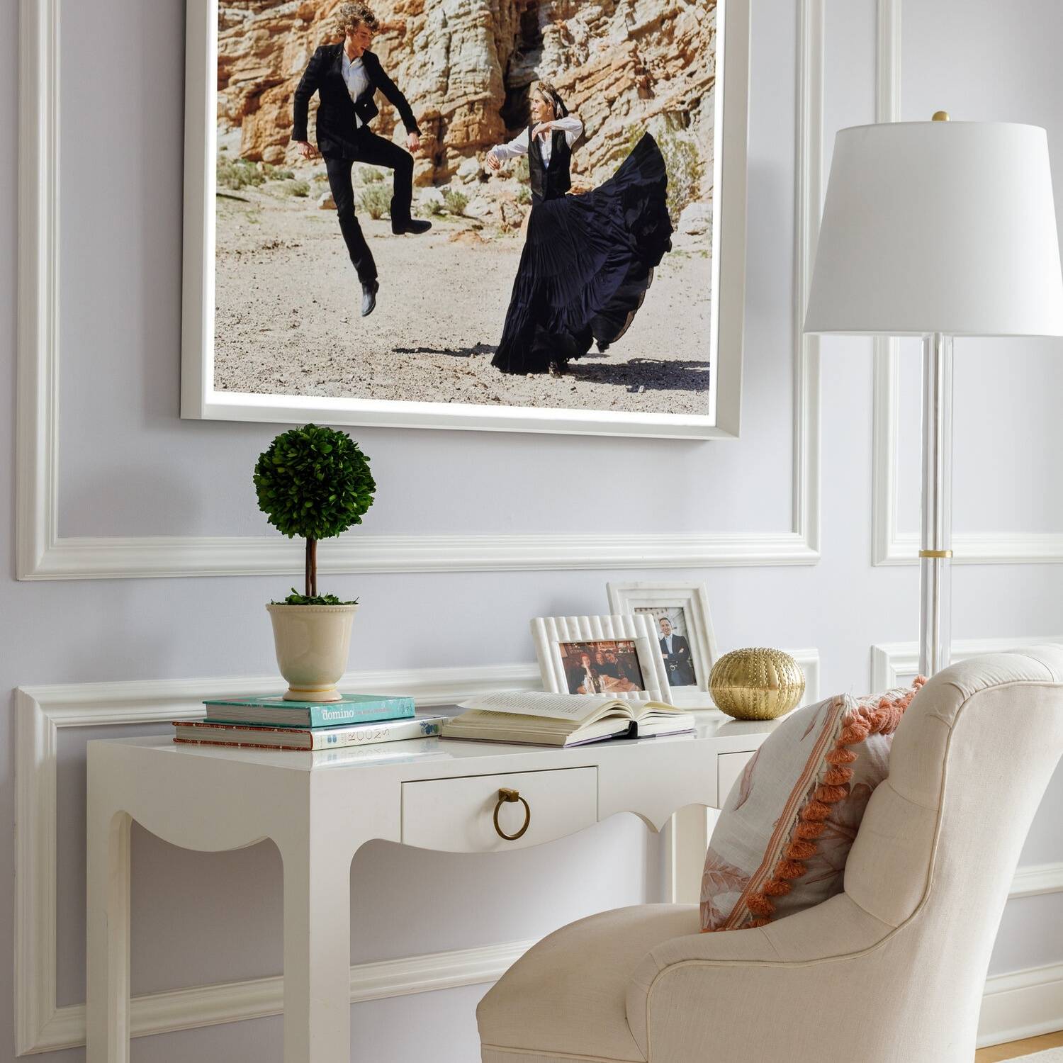
Hanging larger art work makes your home look more expensive. Larger wall art, whether a painting or a print, automatically portrays a high end aesthetic and it will also naturally anchor your room, creating a focal point. It’s grand and it creates a statement. Even if your wall art is neutral and muted with colours, it feels dramatic and expensive.
Custom Woodwork
Custom woodwork is likely the most expensive option to make your home look more expensive but it’s definitely worth it since it'll also add value to your property if you own your home.
Ideas for custom woodwork are board and batten, grids or squares, shiplap (vertical shiplap is a new fresh take on this), beadboard, and modern patterns. The ideas are really endless but it will all make your home look more expensive. Mouldings and millwork are a great method to create a focal area that doesn’t feel busy or overwhelming. And when it comes to costs…moulding in itself is not expensive as you can get baseboard or crown mouldings for less than £10/M2 but the labour costs a lot if you hire.
Painting is another added cost to factor in with custom woodwork. If you’re just painting base or crown you can definitely do it yourself. But if you install a whole wood panelled wall, we recommend getting it professionally painted since they’ll spray it for a smooth, factory finish.
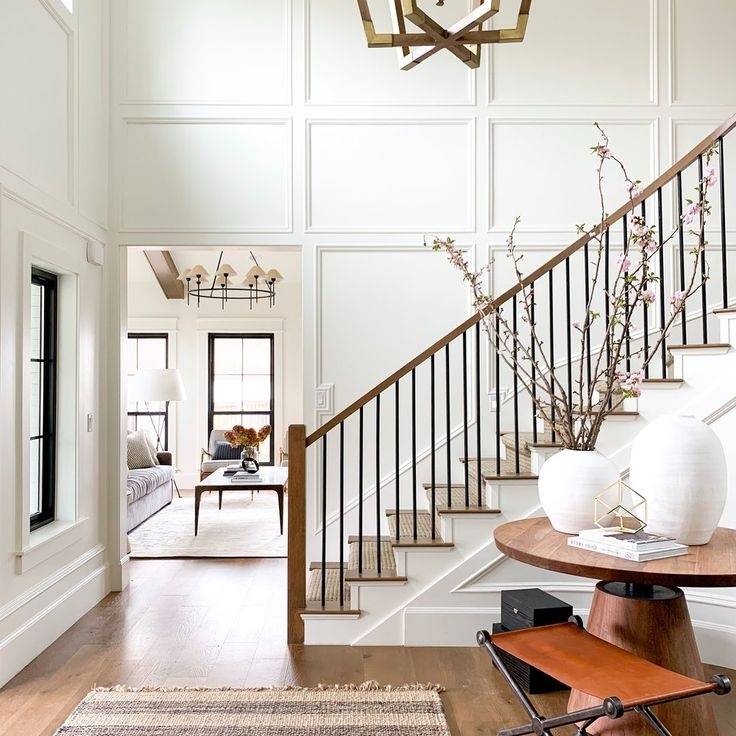
Studio McGee | Board & Batten
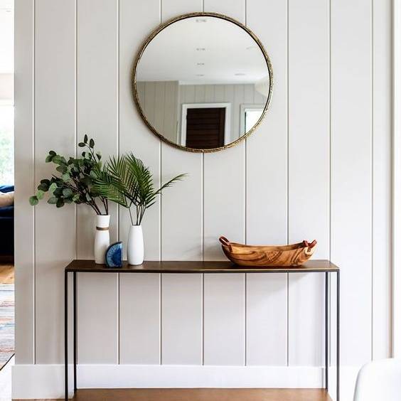
LS Interiors | Vertical Shiplap
Statement Lighting
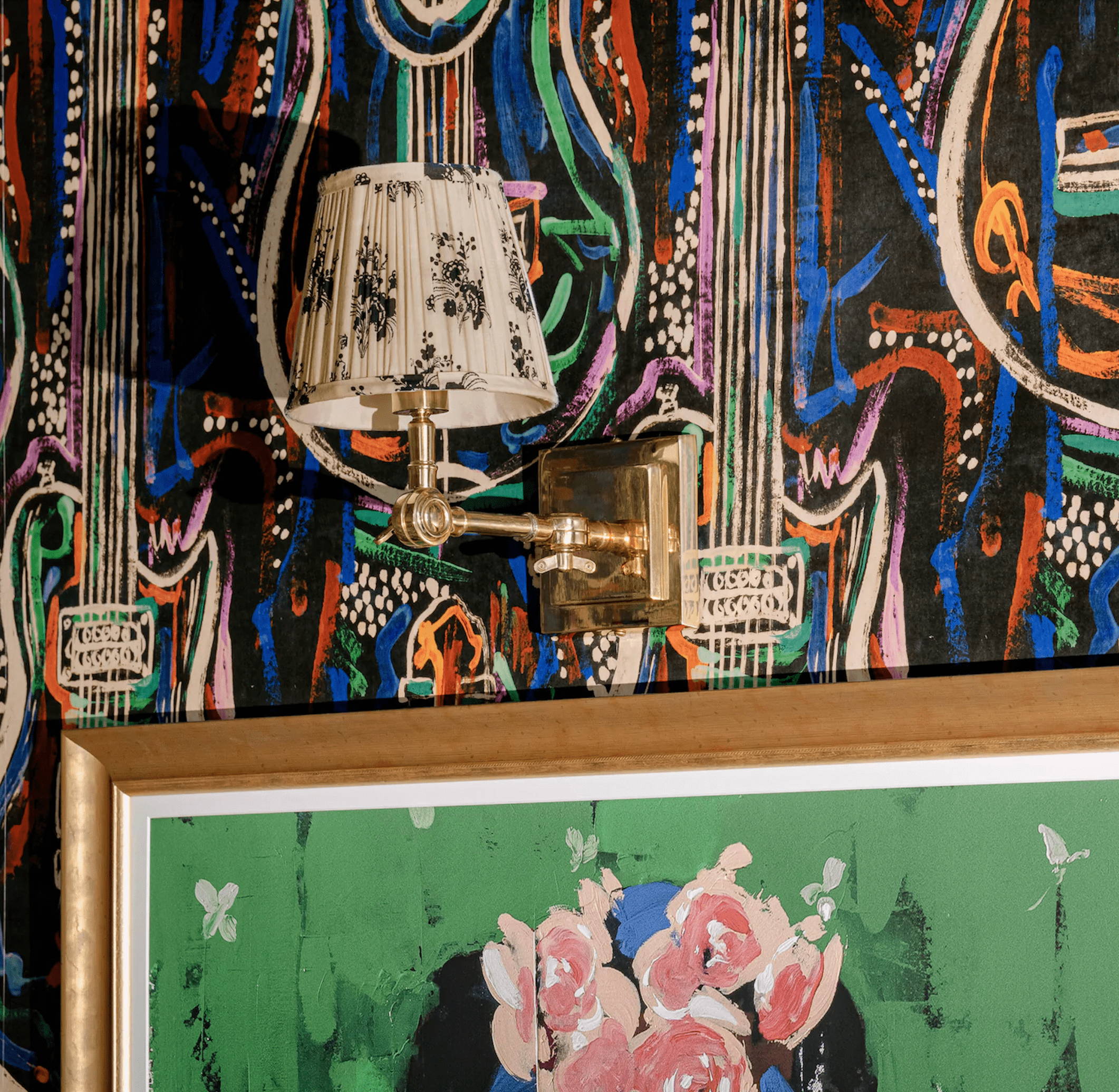
It’s time to ditch the basic light fixtures and go for something a more visually interesting. Think bigger and more dramatic! When adding statement lighting, look for unique shapes, different textures, and colours. Something that is visually interesting and will naturally draw your attention is a great choice.
If you’re nervous about adding a larger pendant light or chandelier in your home, cut out a piece of cardboard or poster board to the same size you’re considering and hang it from the ceiling. Blue painters tape works great for this or you can use a thumbtack and a thin string to hang your paper light fixture cutout.
Add Texture
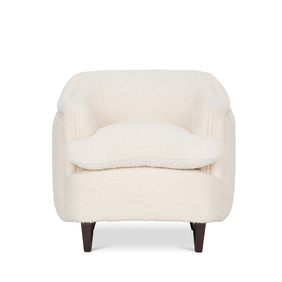
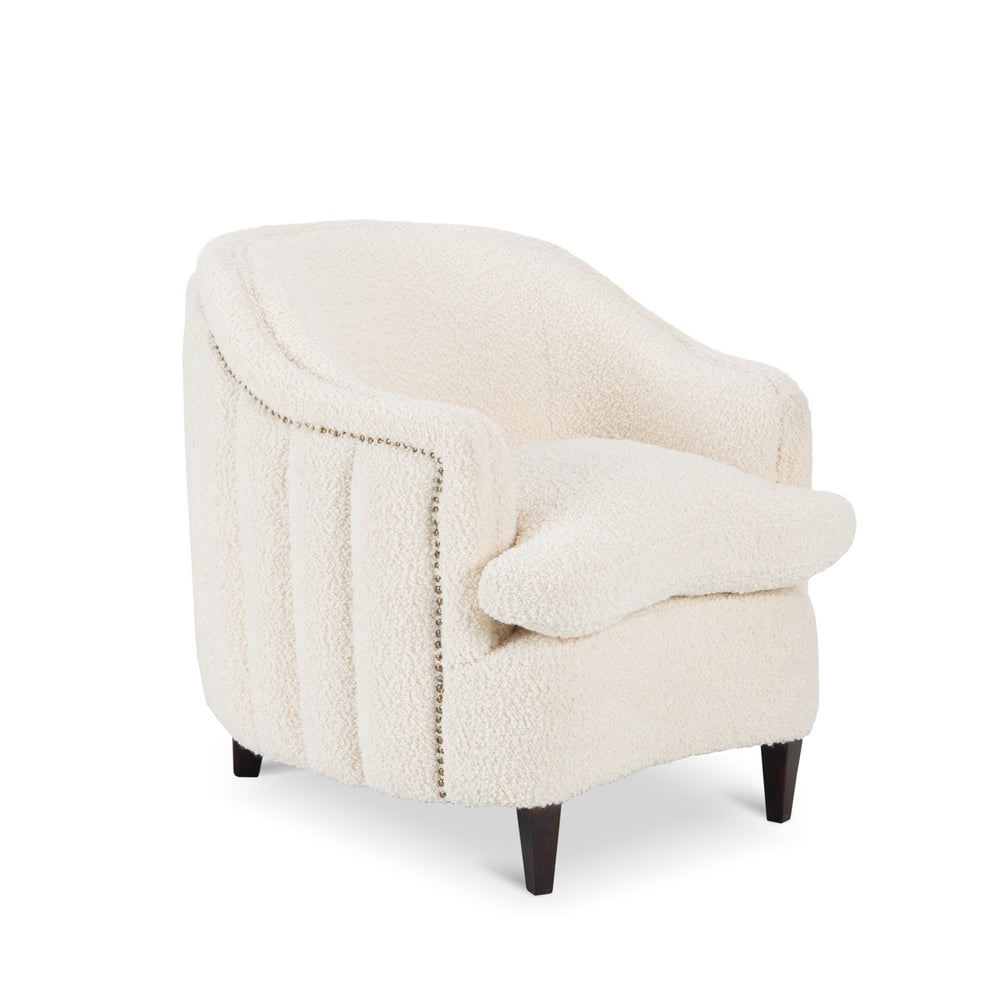
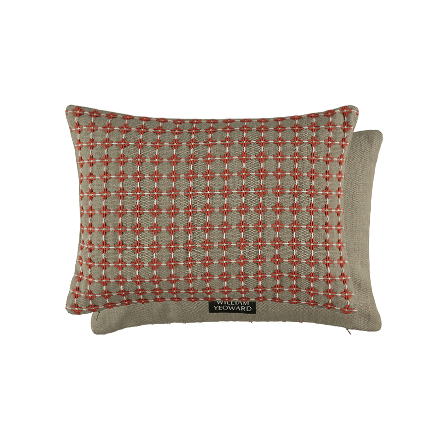
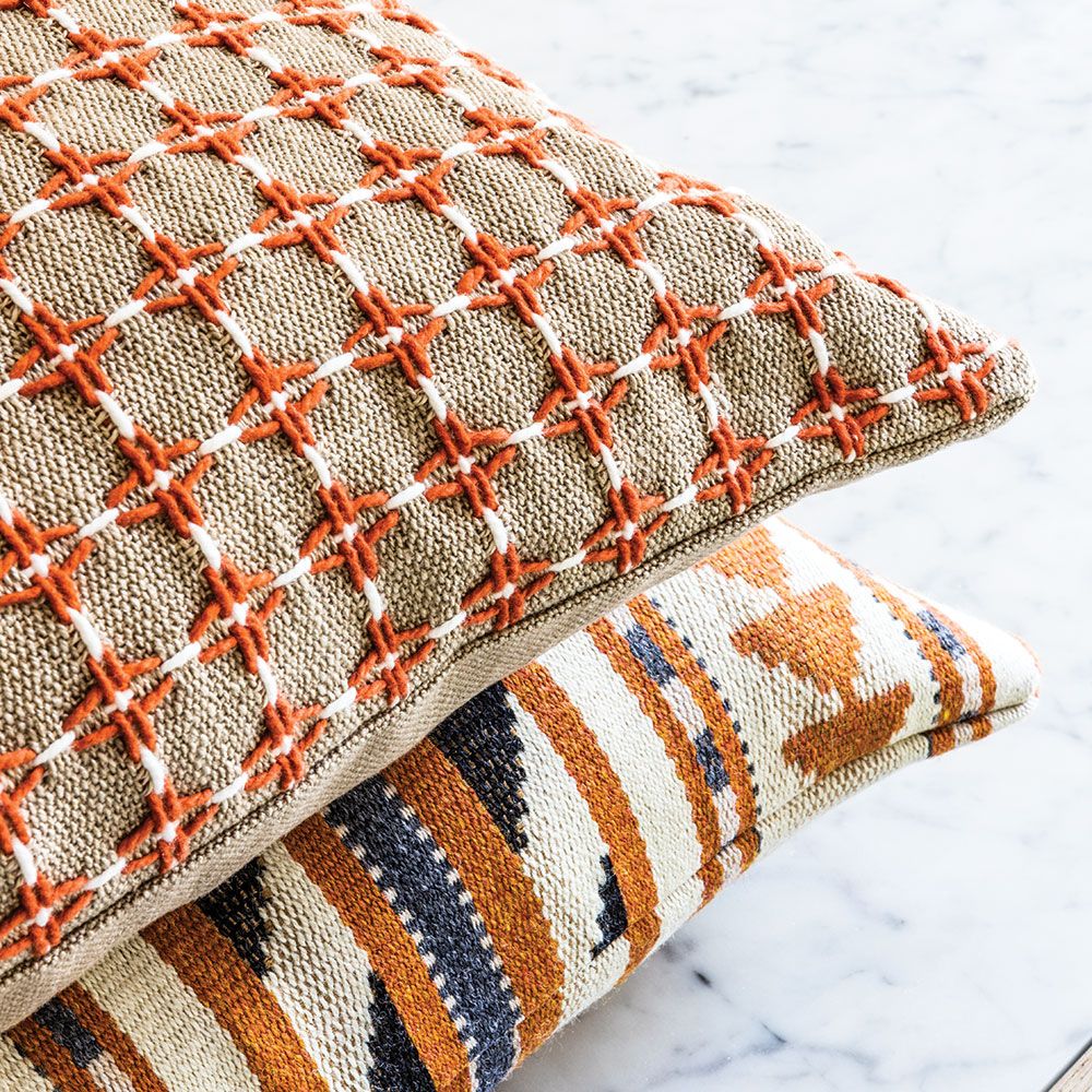
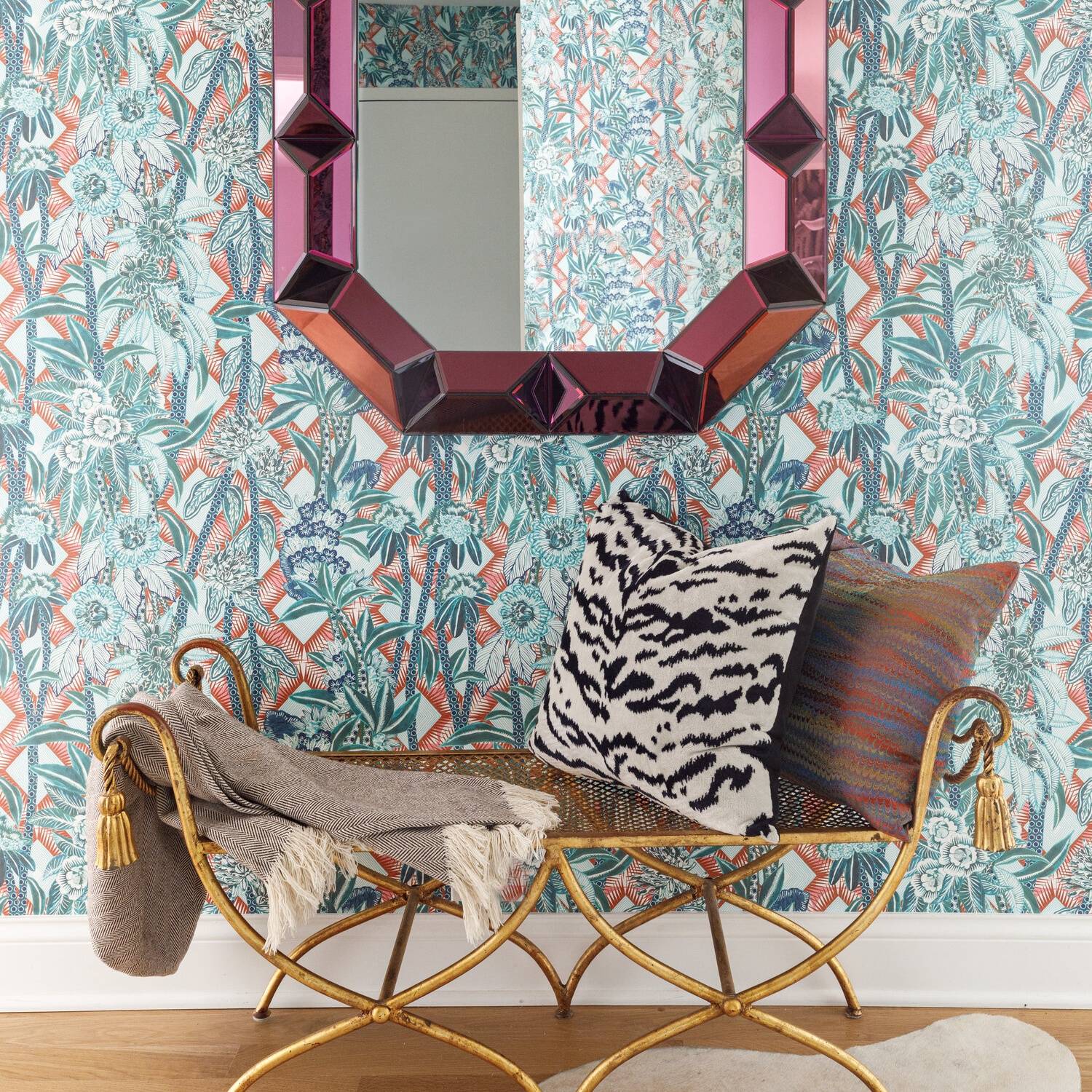
Adding texture to our homes makes them look more expensive. The easiest way to add texture is through fabrics and textiles; whether a rug, lampshade, cushions or throws. You can also add texture with tile, wallpaper, light fixtures, accessories, art. There are many options, however to keep things simple, I'd stick to cushions, rugs and throws and small accessories, such as a rattan tray, a very textured material. Texture also helps our homes feel more comfortable and cozy which grounds our homes so they don’t feel too formal and stuffy.
Our biggest tip? When you’re out and about shopping, keep your eyes peeled for items that are tactile and which you're drawn towards. Add those little touches into your home for an expensive aesthetic!
Declutter
The final tip is not the most exciting or sexiest design tip out there, but it’s HUGE and we cannot stress this enough... You need to get rid of the clutter. Clutter takes away from your home’s design and gives the feel of a cheaper home. It won't matter if you have a marble kitchen, hardwood flooring and designer furnishings, if your home is cluttered it will look cheap no matter what.
Clutter actually affects your energy by draining you. When you’re surrounded by kids toys, shoes and stuff, it impacts how you feel each and every day. Show up as your best self with your home by getting rid of any extra stuff and incorporating some smart storage systems. Magazines? Great, pop them in a basket. Kids toys? Perfect, hide them in a hamper.
For reference, use the example of Selfridges vs Primark. When you walk into Selfridges, you'll notice that everything has its place and it is highly organised. But when you walk into Primark, it’s often crowded, cluttered and products aren’t always in their place.
How many times have you been in Primark and seen things that someone stuck on a shelf because they didn’t feel like putting it away in the right place? But, you hardly see that at Selfridges. When we’re in “nicer” places, we treat them better. Your home is no different! An organised, clean and tidy home sets a different expectation than a messy one.
So take care of your home and get rid of that clutter to help your home to look more expensive for you and your family to enjoy!
A bonus tip that goes along with decluttering is clean up those cords and go wireless. Getting rid of cord clutter makes your home look more finished and polished. If possible, run your cords to your TV in the walls so they’re hidden from sight. The little things often make a big difference!
LOOKING FOR MORE INTERIOR INSPIRATION?
Enter your email address to receive our newsletter


